First Moodboard
Second Moodboard
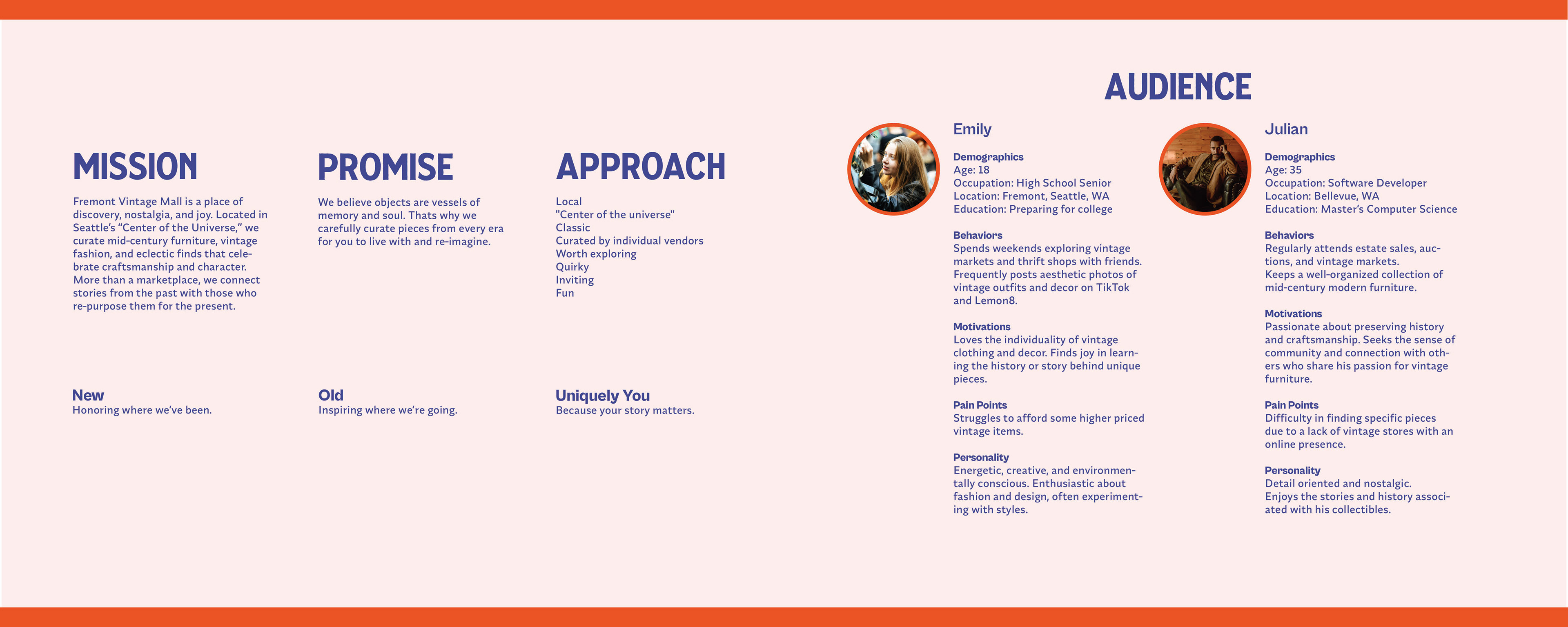
Problem
Fremont Vintage Mall has a strong community and a vibrant mix of vendors, but no unified visual identity. The website didn’t reflect the mall’s personality or make browsing easy. Inconsistent typography, image quality, and layout made it hard to understand what the space offered. A cohesive brand system was needed to highlight its charm and help it stand out in Seattle’s vintage retail scene.
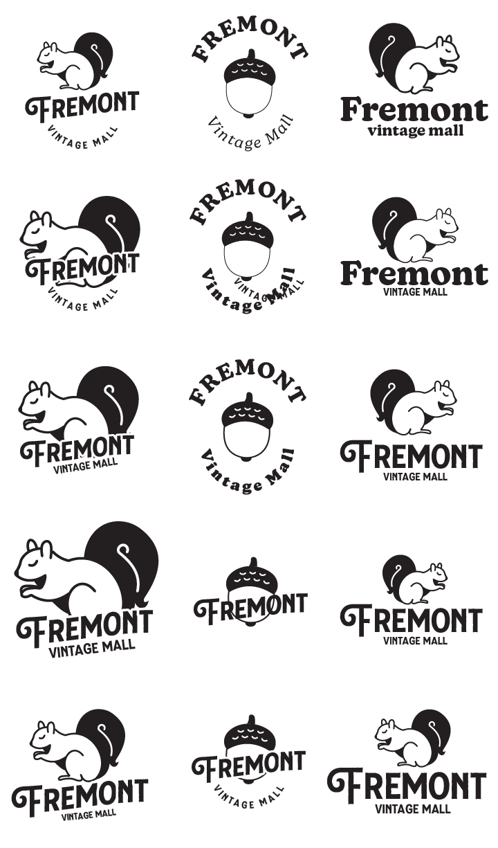
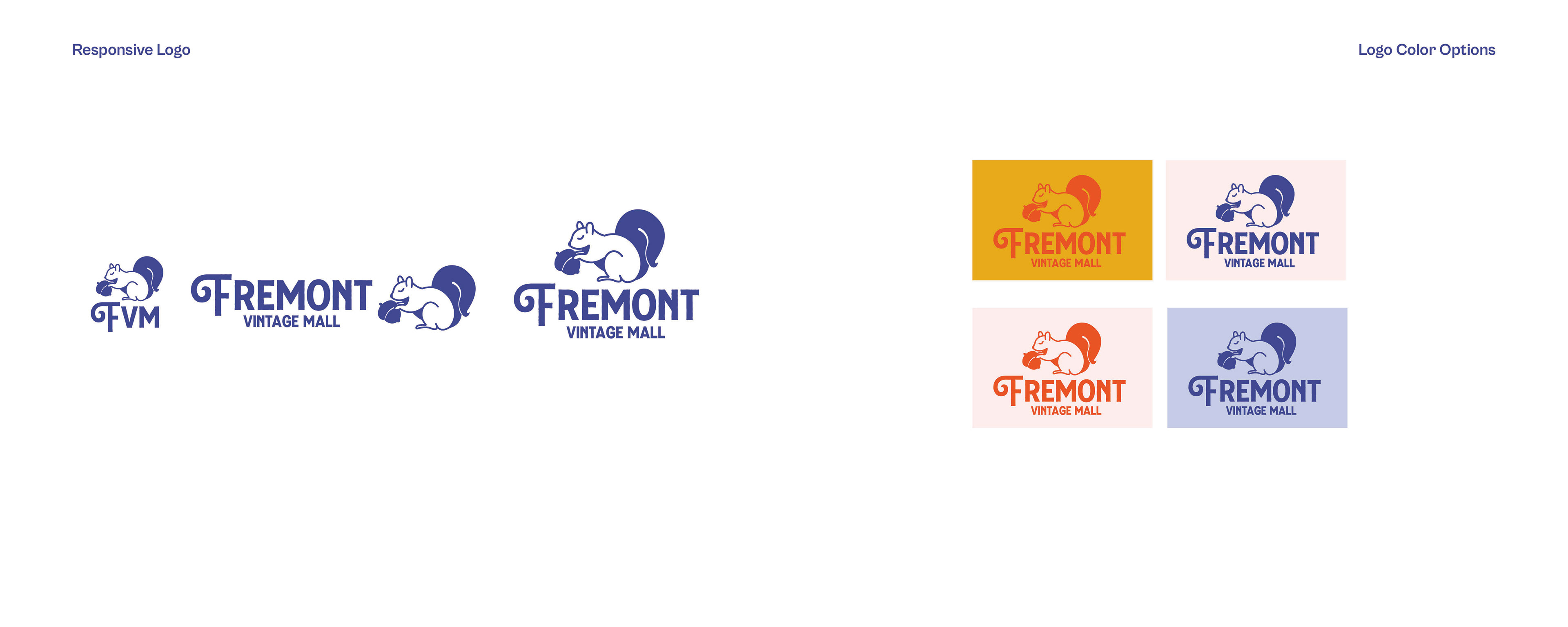
Logo Iterations
Process
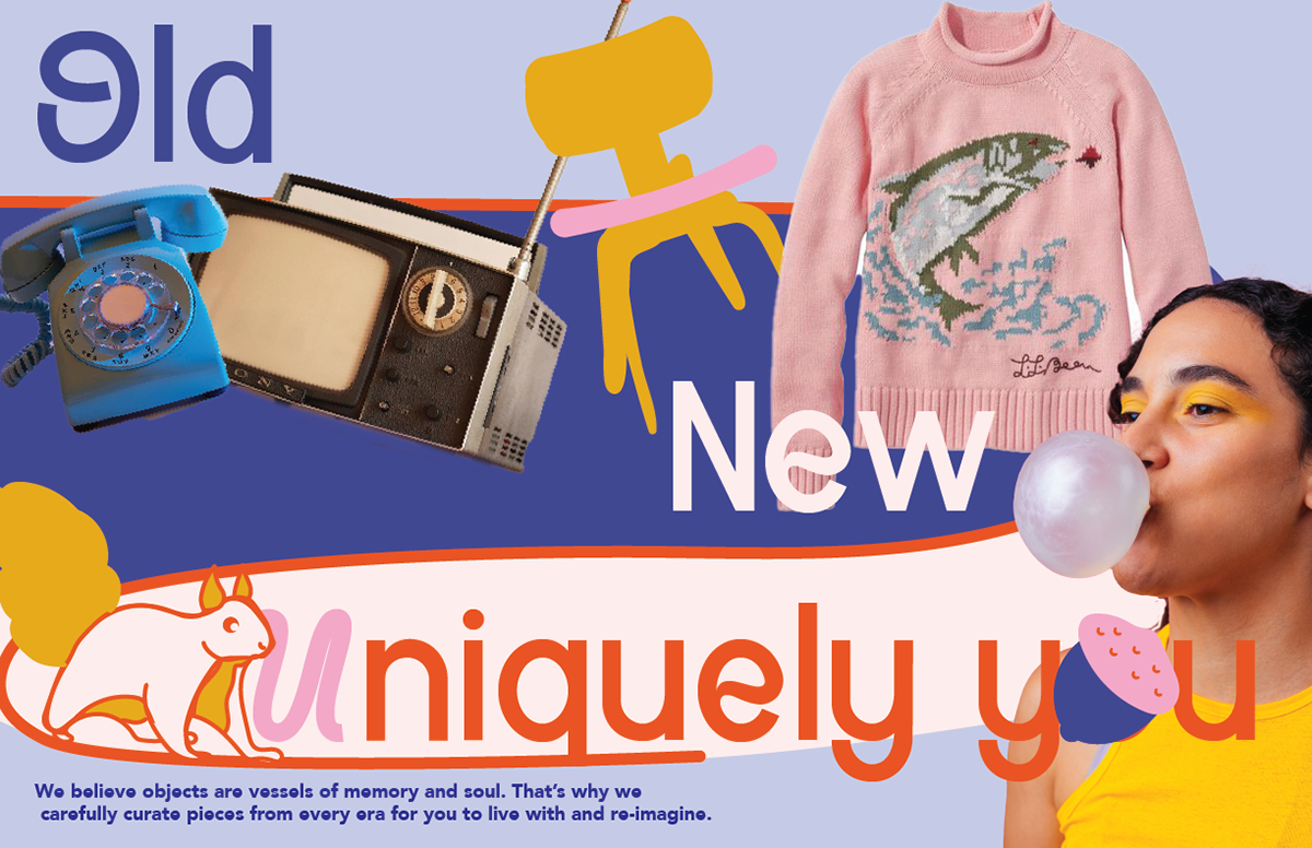
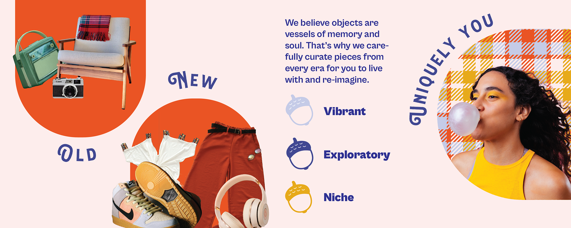
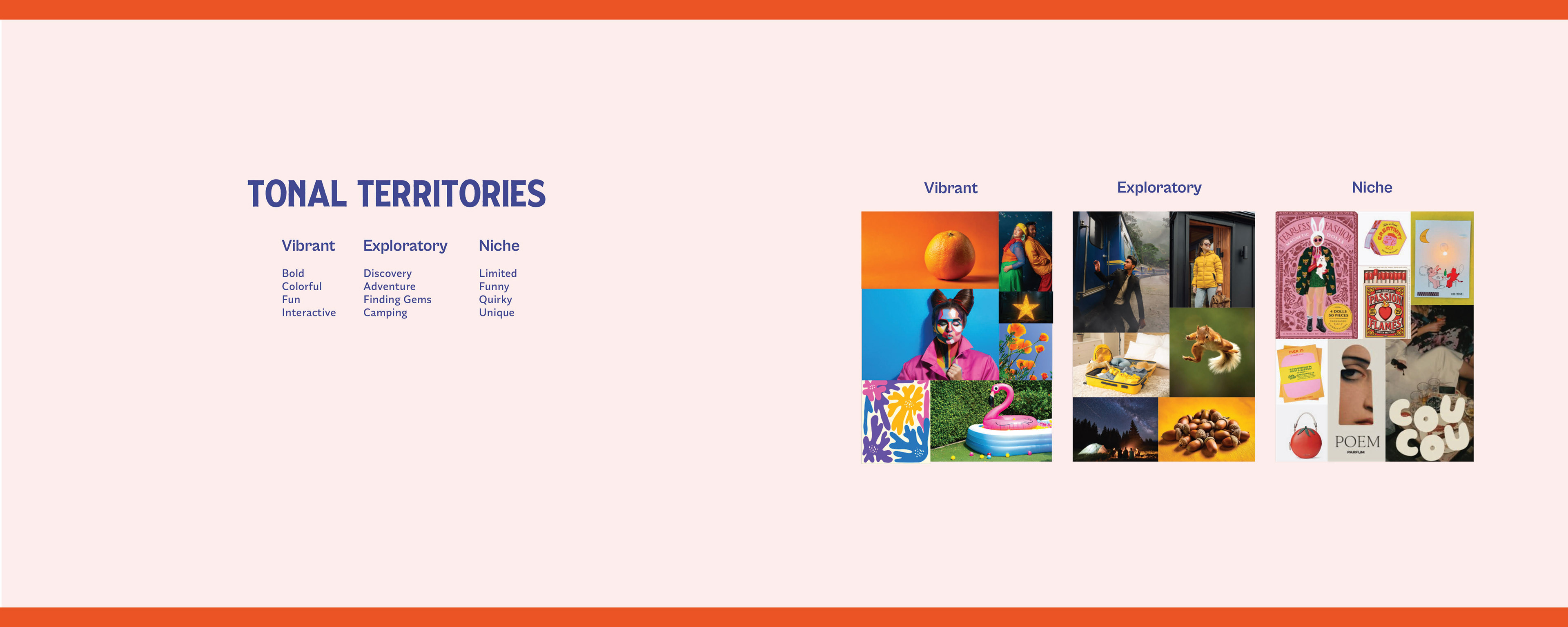
Defined tone: bold, warm, quirky, and nostalgic
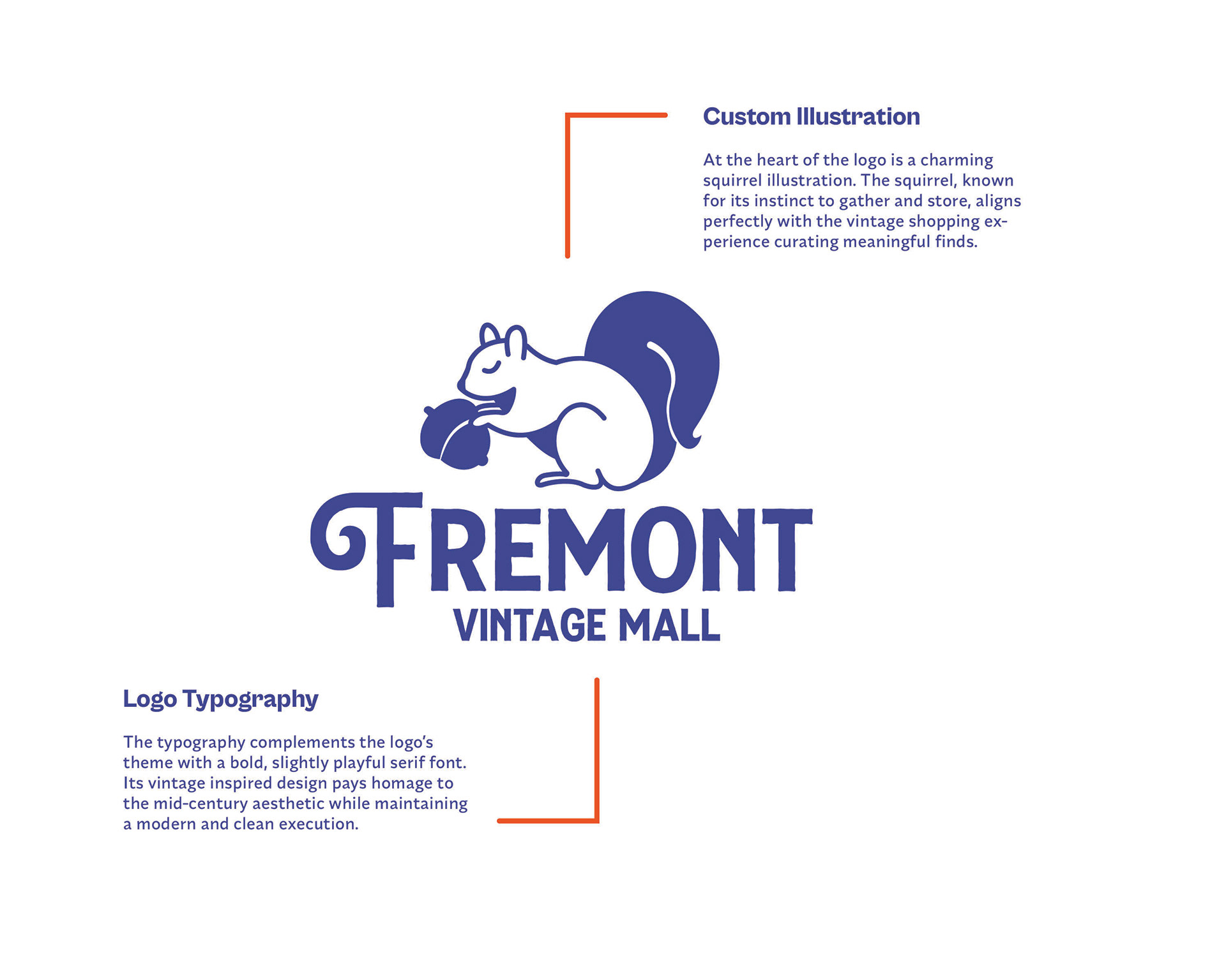
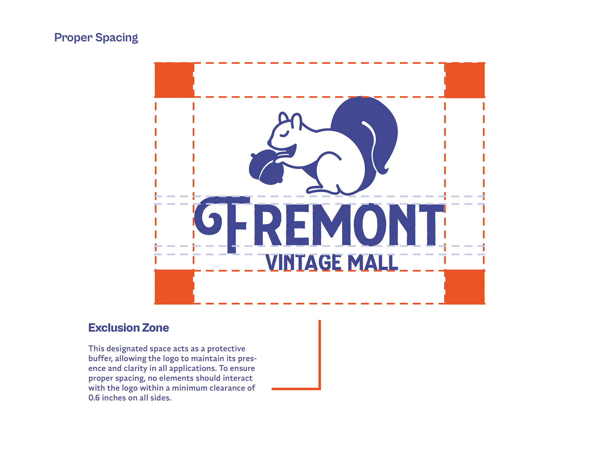
Designed a squirrel mascot and logotype inspired by mid-century storefronts
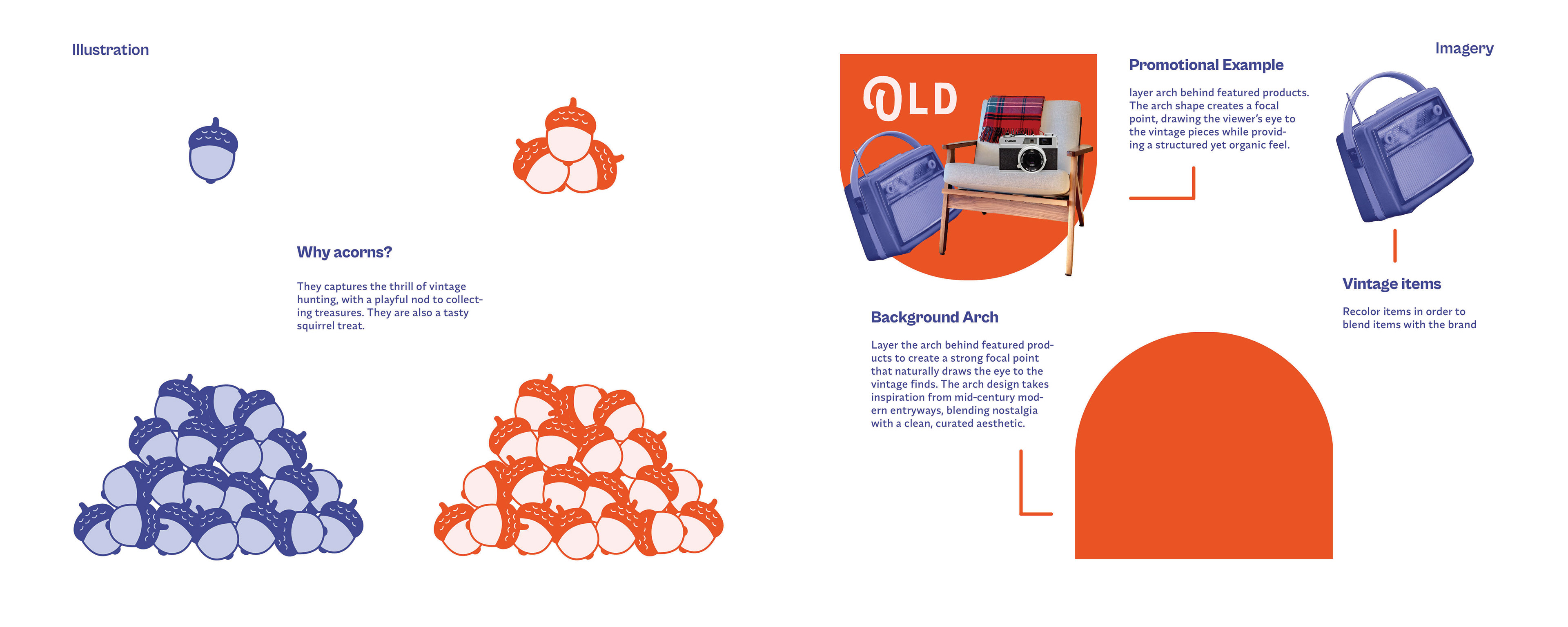
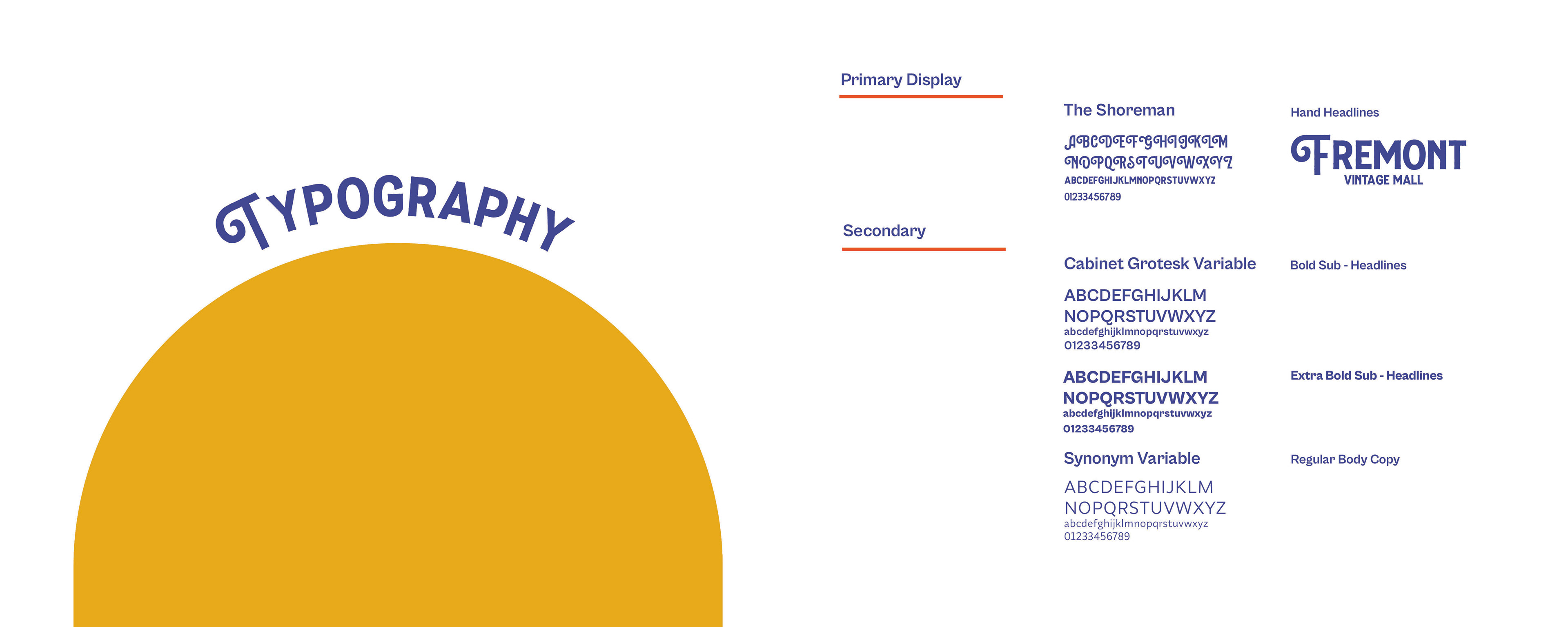
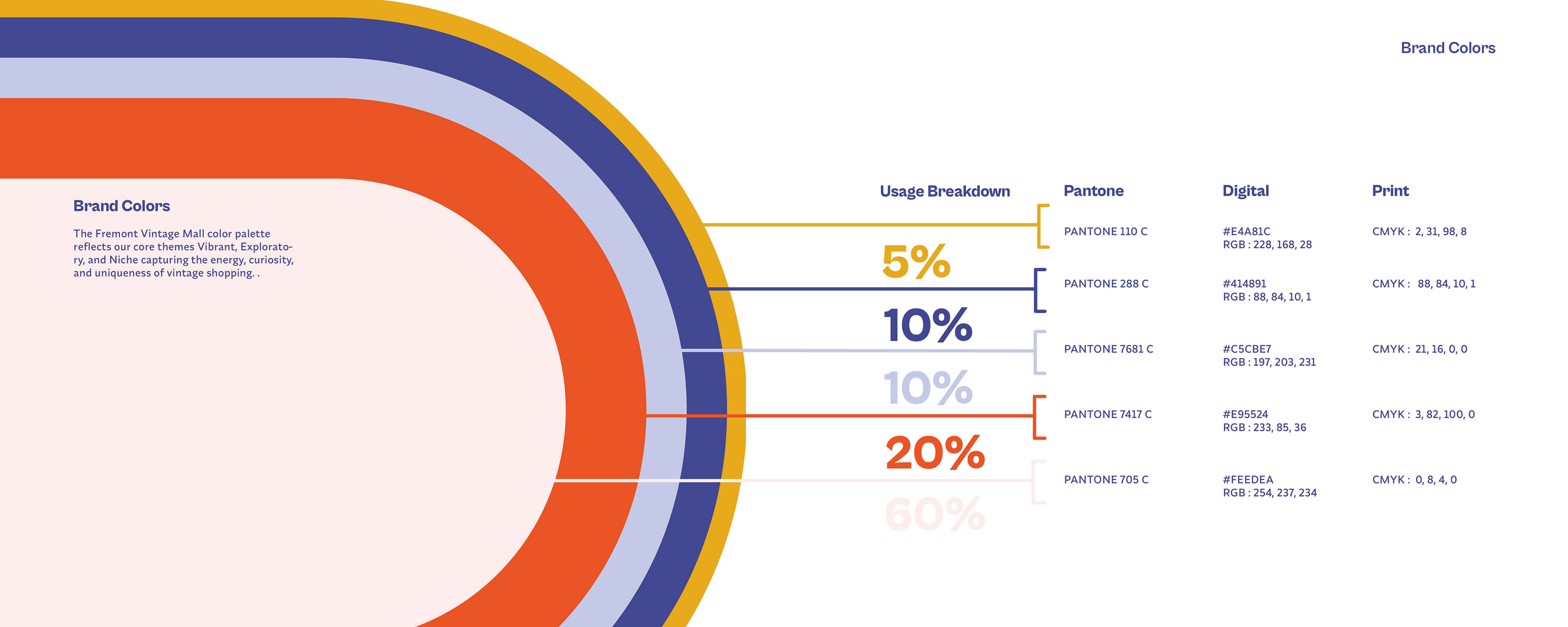
Created a visual system: patterns, icons, display type, and layout rules
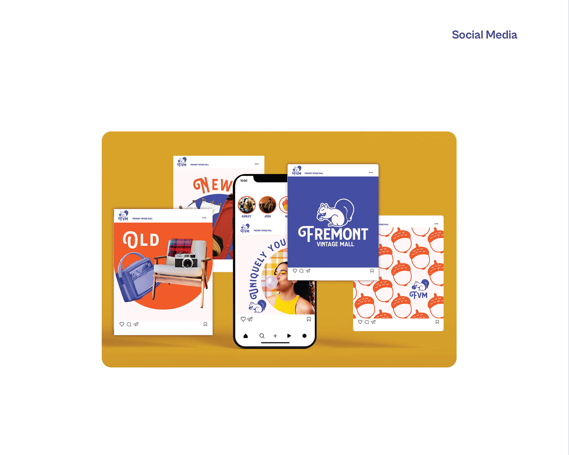
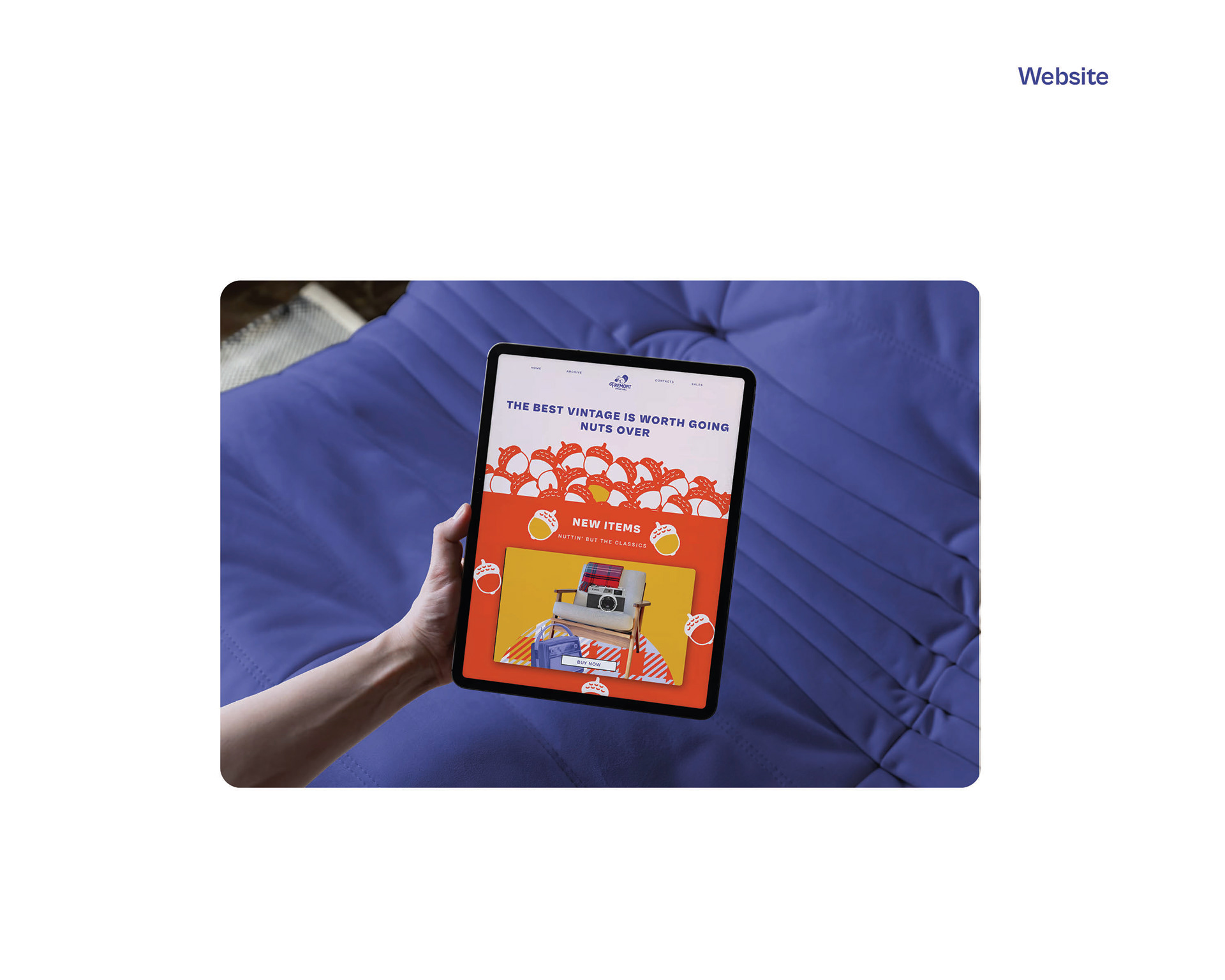
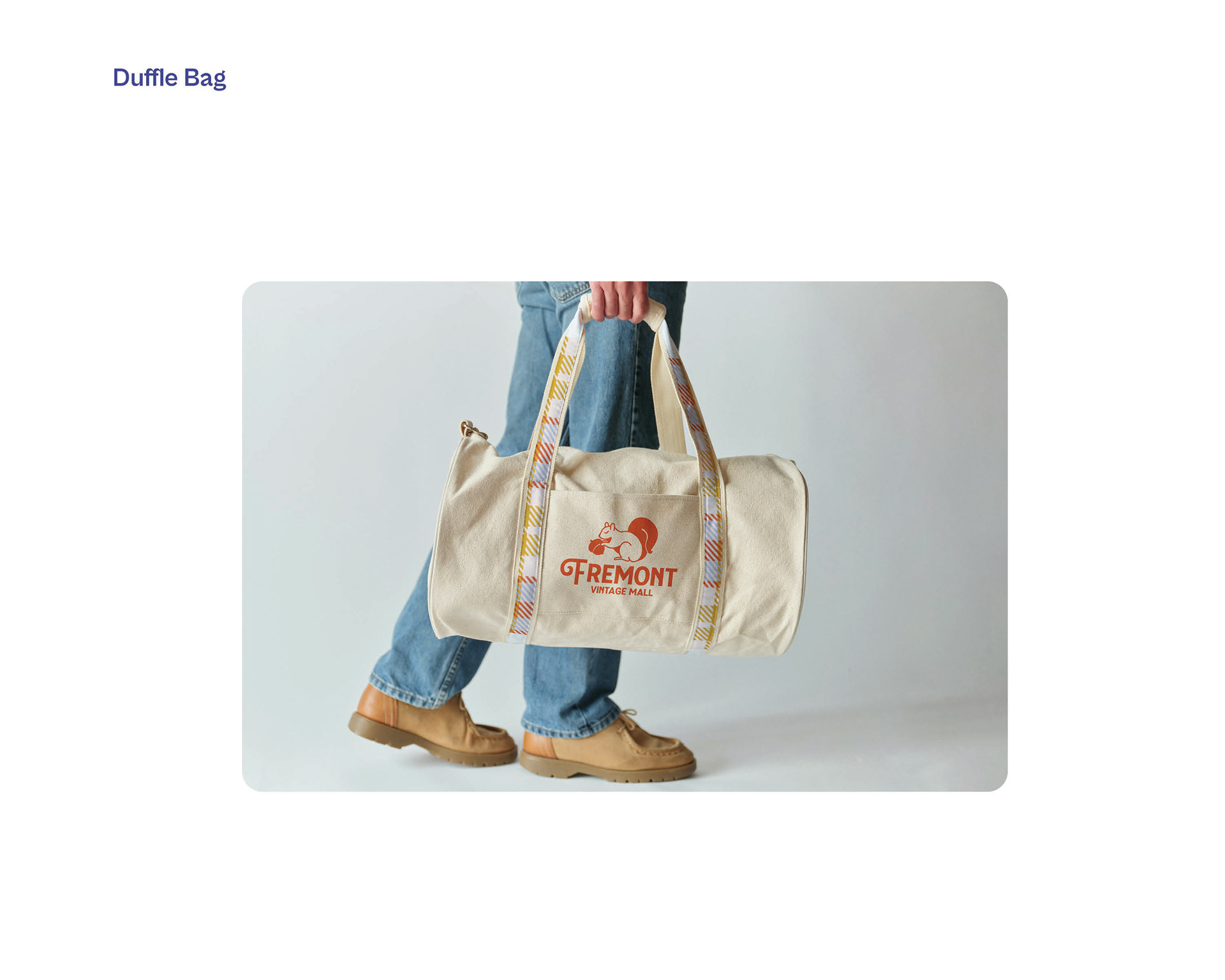
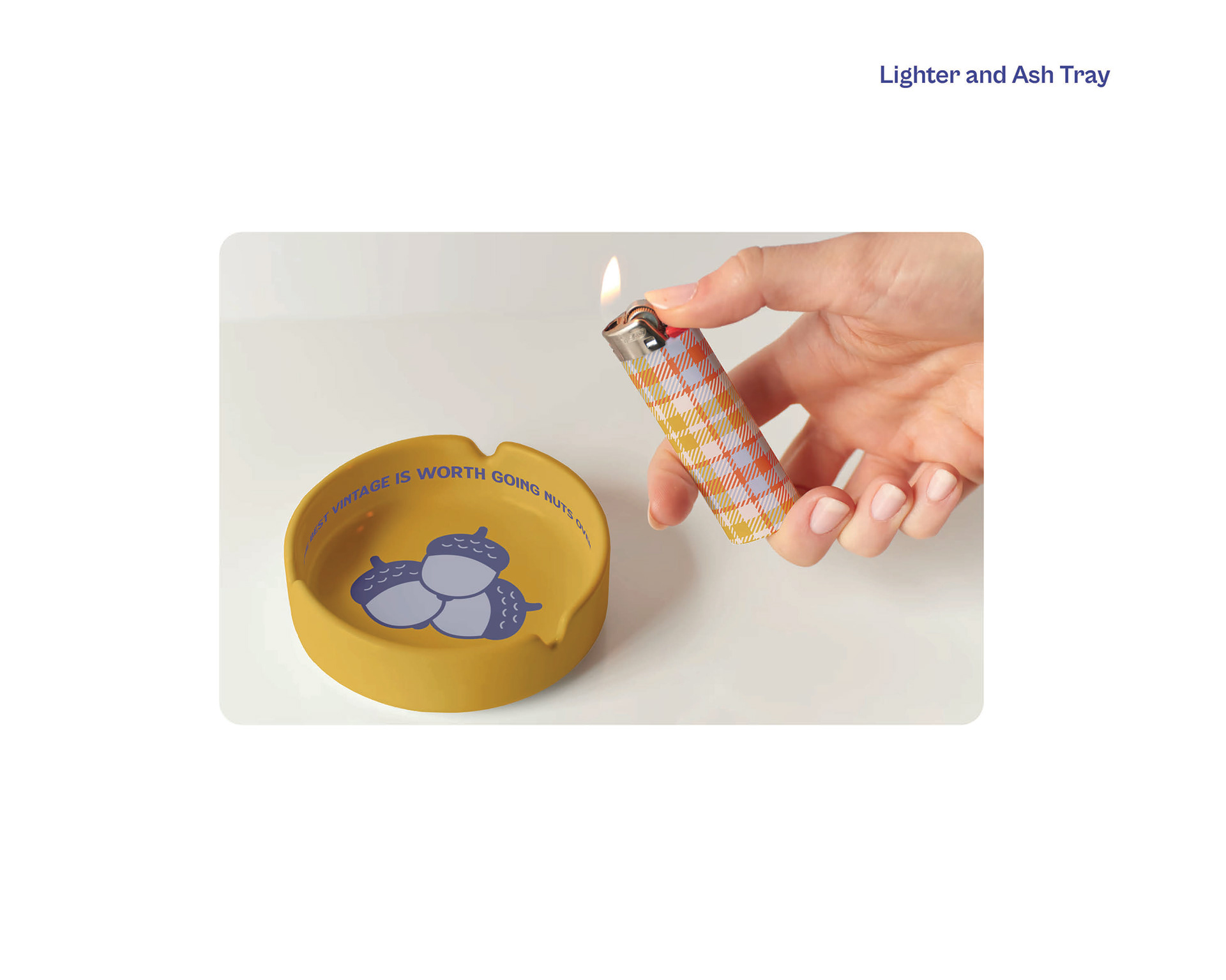
Applied branding to ads, signage, social, and merchandise
Solution
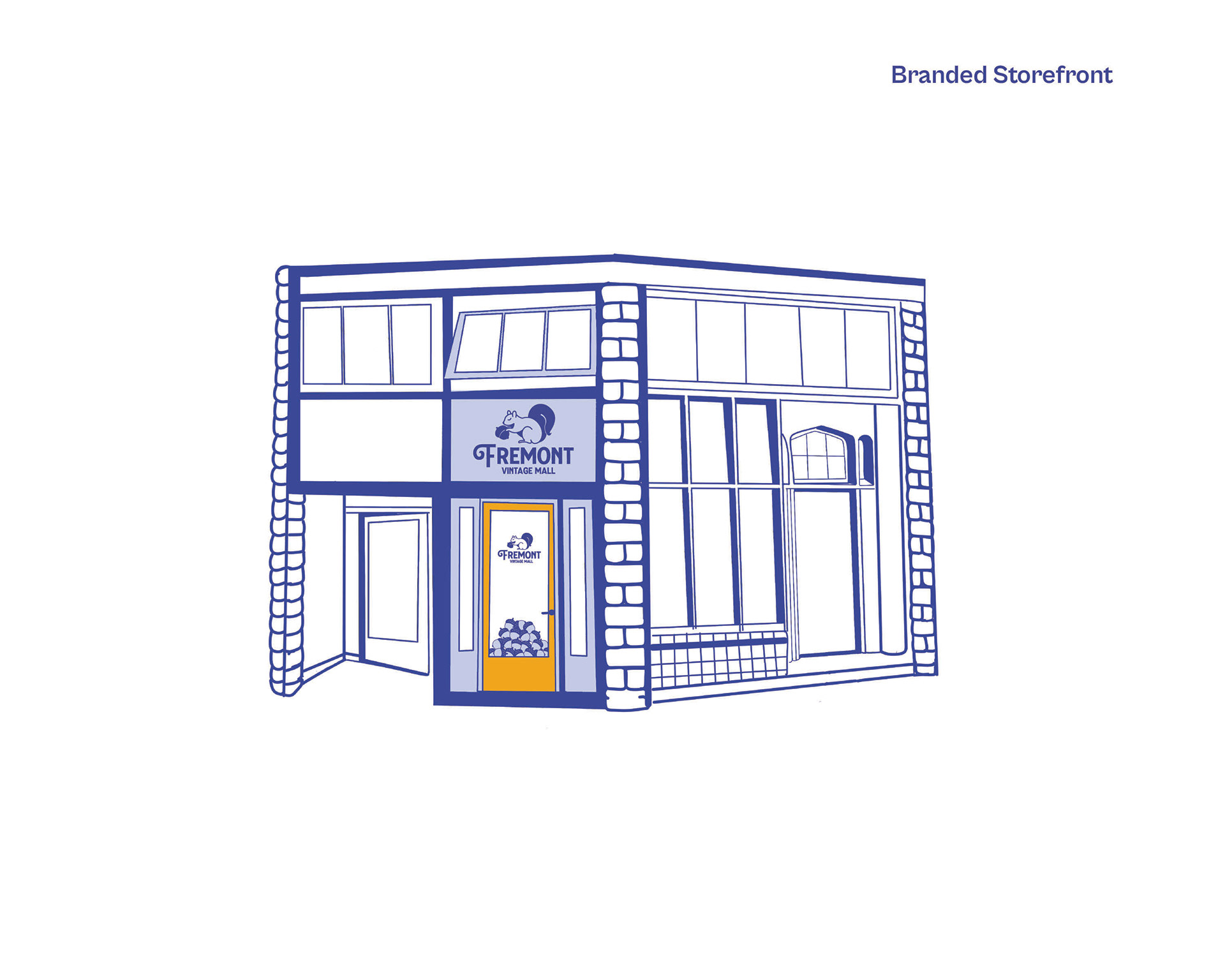
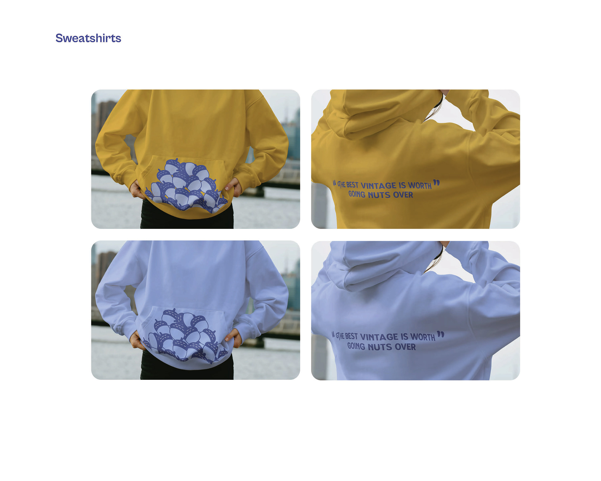
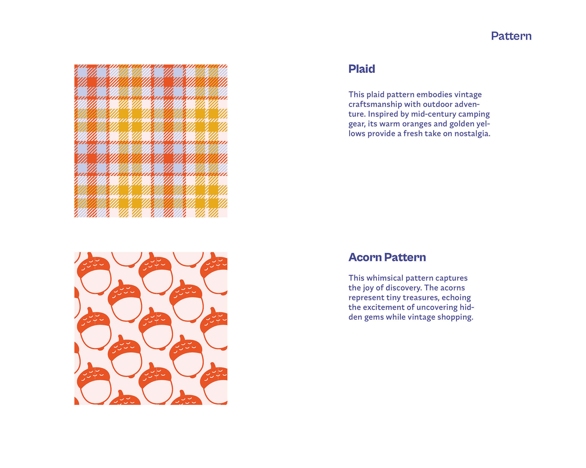
The final identity uses a squirrel mascot and plaid pattern to create instant recognition.
The arch motif nods to mid-century interiors and vendor booth architecture.
Layouts flex across formats while keeping consistency.
The tagline “The best vintage is worth going nuts over” anchors the voice and tone.
The arch motif nods to mid-century interiors and vendor booth architecture.
Layouts flex across formats while keeping consistency.
The tagline “The best vintage is worth going nuts over” anchors the voice and tone.